The Biggies
Golden Globes
Oscars
SAG Awards
Emmys
The Met
Grammys
NAACP Image Awards
Independent Spirits
AMAs
Billboards
VMAs
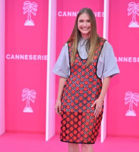
Cannes
TIFF
Venice Film Festival
All
THE LATEST
Lesley, Latifah, and the Rest of the Tonys
Flashback
Individual Fugtrospectives
Classic Movie Premieres
Classic Videos
Classic Photos
(In)Famous Weddings
All Flashbacks
THE LATEST
Live Aid Happened 41 Years Ago Today
Runway
Couture Week
New York RTW
London RTW
Milan RTW
Paris RTW
Resort/Cruise
Pre-Fall
All
THE LATEST
Viktor & Rolf’s Couture Collection Is Very Amusing
WTF
Various Kardashians
Everyone Else
THE LATEST
Camille Razat Has a Surprise For You
Shopping
Our ShopMy Page
Fug Nation Loves...
Our Books
THE LATEST
Fug Nation Loves: The Nordstrom Anniversary Sale!
Fug The Cover
Harper's Bazaar
Anne Hathaway Looks Frankly Great on the Cover of Harper’s BAZAAR’s April 2026 The Now Issue
Mar 26, 2026 by
Jessica
at 11:00 AM
Heads are gonna roll at Vogue!
Read More »
Raye’s Elle Cover Is Really Good
Jan 23, 2026 by
Jessica
at 9:00 AM
I'm pleased to report.
Read More »
Fug The Cover
Cynthia Erivo Harper’s Bazaar Cover Is Legitimately Good
Oct 30, 2025 by
Jessica
at 8:00 AM
How exciting!
Read More »
Elle Does an Actual Editorial Cover
Oct 15, 2025 by
Jessica
at 11:00 AM
With Mia Goth.
Read More »
Harper's Bazaar
The Harper’s Bazaar Global Icon Cover Has Landed With Dua Lipa on Top
Aug 20, 2025 by
Jessica
at 9:00 AM
It's a twofer.
Read More »
Lindsay Lohan Lands the Cover of Elle’s 2025 Summer Issue
May 28, 2025 by
Jessica
at 11:00 AM
I'm relieved to report that this is good.
Read More »
Hannah Einbinder Kinda Nailed This Town & Country Cover
May 2, 2025 by
Jessica
at 10:00 AM
In some major JEWELS.
Read More »
Harper's Bazaar
Linda Evangelista Graces Harper’s Bazaar With Her Presence
Apr 25, 2025 by
Jessica
at 7:00 AM
WHAT A FACE.
Read More »
3
photos »
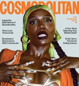
Cosmopolitan
Doechii Landed a Cosmo Cover
Apr 23, 2025 by
Heather
at 11:00 AM
It's her year.
Read More »
Town & Country
Angela Bassett Looks Gorgeous and Glam on the Cover of Town and Country
Feb 21, 2025 by
Jessica
at 7:00 AM
I expected nothing else.
Read More »
Carrie Coon Looks SO GLAM on the Cover of Town & Country
Jan 23, 2025 by
Jessica
at 9:00 AM
AS IT SHOULD BE.
Read More »
8
photos »
Fug The Cover
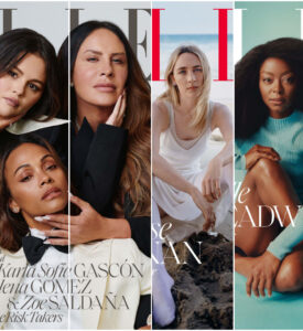
Zoe Saldaña Gets Nippy on Harper’s Bazaar
Jan 23, 2025 by
Heather
at 7:00 AM
In Saint Laurent.
Read More »
20
photos »
Elle
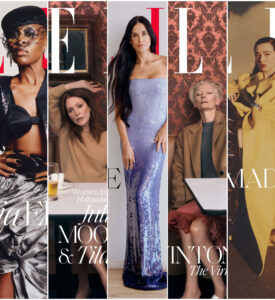
Cynthia Erivo and Mikey Madison Lead the Last Batch of Elle Women in Hollywood Covers
Nov 15, 2024 by
Heather
at 8:00 AM
With SWINTON and Julianne Moore too.
Read More »
17
photos »
Fug The Cover
Elle’s Women in Hollywood Covers Try to Predict the Awards Races a Bit
Nov 15, 2024 by
Heather
at 7:00 AM
We begin with these three.
Read More »
3
photos »
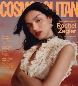
Rachel Zegler Covers Cosmo With An Actual GOOD Celeb-on-Celeb Interview
Nov 1, 2024 by
Heather
at 8:00 AM
It's a Festivus miracle!
Read More »
Page 1 of 20
Next Page
Drinks With Broads Subscribe Box
Shop Our Books
Shop Our Books!
PubExchange
Fug Nation's Favorites
Angelina Jolie Has Arrived in Venice
Amal Clooney Turned Heads in Venice
Cate Blanchett Continues to Sparkle in Venice
Felicity Jones Has Arrived in Venice
Username
Password
Remember me
Not a member?
Sign Up
/
Forgot your password?
Email
Username
Password
Confirm Password
Already a member?
Sign In
Please enter your account email address, we'll send you an email with instructions to reset your password:
Cancel