The Biggies
Golden Globes
Oscars
SAG Awards
Emmys
The Met
Grammys
NAACP Image Awards
Independent Spirits
AMAs
Billboards
VMAs
Cannes
TIFF
Venice Film Festival
All
THE LATEST
Lesley, Latifah, and the Rest of the Tonys
Flashback
Individual Fugtrospectives
Classic Movie Premieres
Classic Videos
Classic Photos
(In)Famous Weddings
All Flashbacks
THE LATEST
Your 2026 Met Gala Committee In History
Runway
Couture Week
New York RTW
London RTW
Milan RTW
Paris RTW
Resort/Cruise
Pre-Fall
All
THE LATEST
Carolina Herrera’s New Resort Collection Is VERY Celeb-Friendly
WTF
Various Kardashians
Everyone Else
THE LATEST
Camille Razat Has a Surprise For You
Shopping
Our ShopMy Page
Fug Nation Loves...
Our Books
THE LATEST
Fug Nation Loves Small, Various Delights For Summer
Vogue - Page 3
3
photos »
Kaia Gerber Nabbed Her First Solo Vogue Cover
May 19, 2021 by
Heather
at 9:00 AM
It seemed inevitable.
Read More »
Amanda Gorman Ascends to a Vogue Cover
Apr 8, 2021 by
Heather
at 7:00 AM
3
photos »
She's on the May 2021 issue.
Read More »
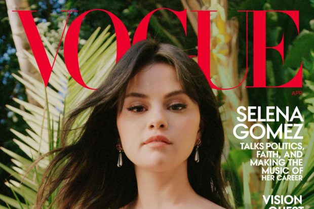
Selena Gomez Is Vogue’s Best Cover in a While
Mar 10, 2021 by
Heather
at 10:00 AM
3
photos »
Welcome back, kiddo.
Read More »
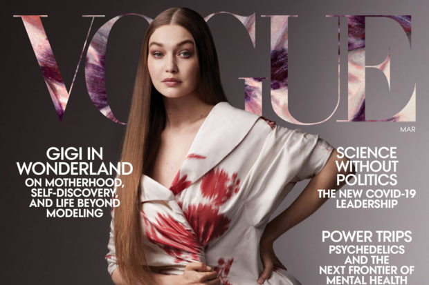
Gigi Hadid Pops Back Into the Public Eye on Vogue
Feb 16, 2021 by
Heather
at 7:00 AM
3
photos »
She's the March cover girl.
Read More »
3
photos »
Harry Styles Is The First Dude to Land a Solo Vogue Cover
Nov 19, 2020 by
Heather
at 7:00 AM
"Styles" is right.
Read More »
Well Played
Well Played, Sarah Jessica Parker
Mar 12, 2014 by
Jessica
at 9:30 AM
It is true that this is not the sort of content we usually post, but the nice folks at Condé Nast…
Read More »
Fugs
Fug Vogue Party: Maskapalooza Omnibus
Oct 1, 2010 by
Heather
at 12:00 PM
The Roitfelds were a naked surprise at the French Vogue party, but there were loads of other amusing outfits at…
Read More »
Fugs
The Roitfugs
Oct 1, 2010 by
Heather
at 11:00 AM
Apparently, French Vogue celebrated its 90th birthday at Paris Fashion Week with a masquerade-themed party -- well, I assume…
Read More »
Prev Page
Page 3
Drinks With Broads Subscribe Box
Shop Our Books
Shop Our Books!
PubExchange
Fug Nation's Favorites
Angelina Jolie Has Arrived in Venice
Amal Clooney Turned Heads in Venice
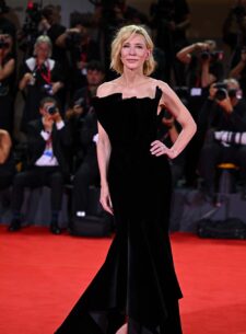
Cate Blanchett Continues to Sparkle in Venice
Felicity Jones Has Arrived in Venice
Username
Password
Remember me
Not a member?
Sign Up
/
Forgot your password?
Email
Username
Password
Confirm Password
Already a member?
Sign In
Please enter your account email address, we'll send you an email with instructions to reset your password:
Cancel